A Free Guide to Data Center Visualization
A huge volume of data circulates within a data center, but there’s also a significant amount of data generated about the data center that is essential to ensuring its smooth operation. It is vital for data center operators to have effective means of processing, analyzing, and interacting with this data to ensure the efficiency of both the data center and the overall business. Achieving this goal requires operators to transform raw data into valuable insights, knowledge, and wisdom, and visualization can play a key role in this process.
Data center visualizations are models of physical data center configurations that help engineers and administrators understand and manage their facilities. In this article, we explore why visualizations are critical to effectively communicating complex information and discuss how they can enhance the overall understanding of the data being presented. The article provides insight into the best practices for data center visualizations and covers the different types of visual aids that can be used to cater to the requirements of the operator.
Summary of key data center visualization concepts
| What are data center visualizations? | Data center visualizations are digital representations of physical data centers and visually present complex data sets, enabling operators to make informed decisions. |
| What are the benefits of data center visualization? | Data center visualizations provide a clear view of the current and potential future state of a data center. They are an effective way to communicate insights from data and provide stakeholders with timely information that enables better decision-making, faster outage resolution, and improved collaboration. |
| Planning and implementing | It is essential to establish reliable and trusted data as the basis for a visualization. Once this is done, delineate, construct, and confirm the visualization’s accuracy and credibility. |
| Best practices |
|
What is data center visualization?
A data center visualization is a digital representation of a physical data center. Creating a visualization is a process of visually representing data related to components of a data center in a variety of formats, which helps convert data into actionable insights. By providing clear and concise visual representations of complex data sets, visualizations allow operators to make informed decisions and take swift action when needed. In this context, a picture is maybe not worth a thousand words but instead thousands of data points that insightfully portray the data center itself. We will discuss the specifics involved in this later in the article.
Visualizations involve developing a system that enables operators to experience the data center virtually, as if they were present on-site. They are able to convey information about all aspects of the data center, including buildings, rooms, racks, supporting infrastructure, IT equipment, applications, and networks.
Applications in other business disciplines are used to assist in visual presentations, such as business intelligence tools, building information modeling (BIM) products, and simulation tools. Business intelligence tools are utilized to present business data, BIM tools provide a shared knowledge resource for architecture and engineering teams to collaborate on building data, and simulation tools visually represent business or engineering challenges. All these tools maintain a focus on visually presenting data.
Benefits of data center visualization
Data center visualization has the potential to deliver on the classic marketing pitch of many IT companies: delivering the right data, to the right individuals, at the right time. By collecting and presenting real-time data on the operational status of data centers, all stakeholders (internal and external) can access the relevant, timely information they require to gain valuable insights quickly and efficiently.
Specifically, data center visualizations can enable organizations to do the following:
- Gain greater insights into real-time operating conditions for improved decision-making.
- Identify correlations between operations and outcomes.
- React to and resolve outages more quickly.
- Facilitate collaboration by providing a shared visual platform for drawing conclusions.
- Streamline data center planning and design by using what-if scenarios.
- Analyze trends in data to identify opportunities for improvement while avoiding incidents.
- Promote user engagement and empower data-driven decisions by providing a clearer view of the data center’s operations.
Planning and implementing data center visualizations
The foundation of successful data center visualizations is authentic and trustworthy data: The right data must be extracted and curated to convey the intended story. After securing the right data, crafting compelling representations of the data involves a three-step process: defining, designing, and validating/verifying.

Defining
Start the process by defining and setting the scope for what the visualization should achieve. Determine and document the data that will be represented, the perspective of the audience viewing the visualization, and the most appropriate lens for highlighting the data.
Know your data
The foundation of a data center visualization is authentic and trustworthy data. Data can be sourced from various telemetry sources, including data center infrastructure management (DCIM) systems, a configuration management database (CMDB), and Simple Network Management Protocol (SNMP) data points. The CMDB contains a comprehensive collection of configuration items (CIs), consisting of all hardware and software assets in the data center and their relationships with other CIs. Keeping the CMDB up to date and accurate is imperative to ensuring that the visualizations created accurately represent the data.
Know your audience
Identify the target audience, including visuals for IT executives, operations managers, finance personnel, engineers, and others, and endeavor to understand their perspectives. This will enable you to tailor data presentations to effectively communicate the insights that will be most valuable to them.
Know your setting
Keep things as simple as possible, and know what data and visualization types will be the most relevant for what is being presented. Extraneous data and visual cues will only detract, while providing the proper context for the data will deepen the audience’s understanding.
Designing
The design phase of visualization includes determining how the visualization is to be delivered and matching the data to the most effective presentation types. These two decisions are paramount to ensuring that the visualization provides maximum benefit to the user.
Visualizations will typically be depicted as either physical or logical. Physical visualizations tend to be more tangible and can be useful for presenting information related to hardware components and their physical locations. Logical visualizations are more abstract and are better suited for conveying information about software systems, network topologies, and other related concepts.
To match data to the right type of visualization, review the output of how you defined the visualization, and understand the multitude of visualization types and the benefits that each has to offer. The data will typically dictate the right match for how it is to be visualized, but researching the visualization types and how each functions will help drive the value of the data center data presentation.
The following are some of the types of visualizations that can be used.
Dashboards
Dashboards are arguably the most potent form of visualization for generating the data-based information crucial for informed decision-making in the context of data centers. By leveraging a blend of charts, graphs, gauges, and other components, dashboards excel at facilitating the simplified presentation of intricate data. They enable the consolidation of information from diverse data sources and offer real-time updates, empowering users to swiftly explore and interpret data.
Key performance indicators (KPIs) are a prime example of data center metrics deserving a dashboard. They distill critical performance information that captures the essence of the data center’s operation.
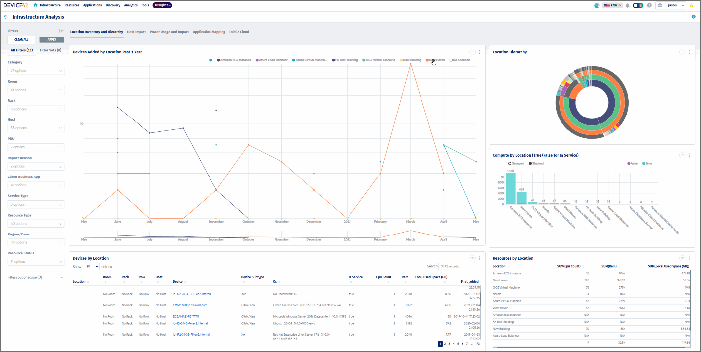
Location inventory and hierarchy dashboard (source)
Physical data center and IT representations
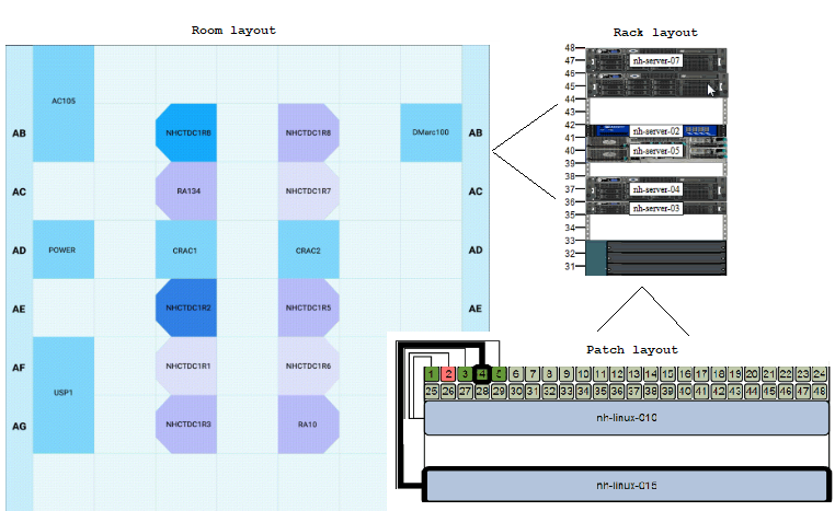
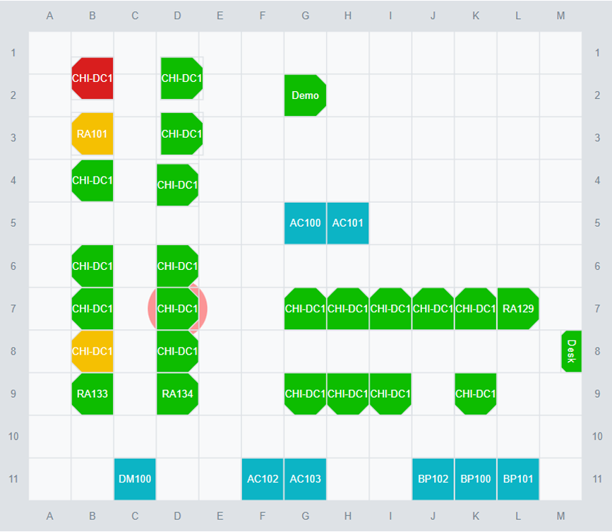
These visualization types include building-level drawings, room floor plans (2D or 3D), and rack and row elevations for IT equipment (compute, storage, and network). They are incredibly valuable for getting a big picture about the data center and are commonly employed to furnish users with direct visibility into the data center’s various layers.
If the visualizations are created with precise and up-to-date information, they offer users the opportunity to deeply engage with the data center setting. Users can manipulate objects, quickly view object specifics, and incorporate CMDB data to gain a practical understanding of the data center.

Data center room, rack, and patch layouts (source)
Network topology
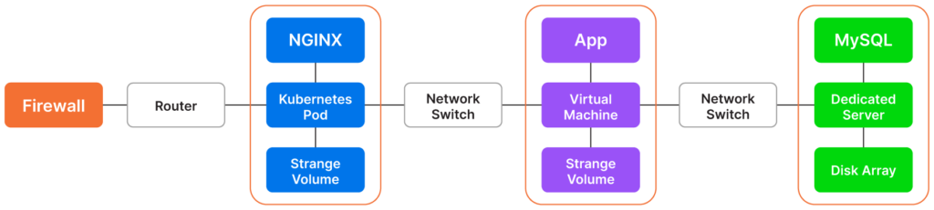
These visualizations depict the logical and physical connections among devices and offer a comprehensive view of the data center topology. These representations showcase cabling connections, patch panel assignments, and other relevant information. By incorporating diverse data sources, the visualization accurately portrays the architecture and relationships, empowering users to gain valuable insights through data exploration.
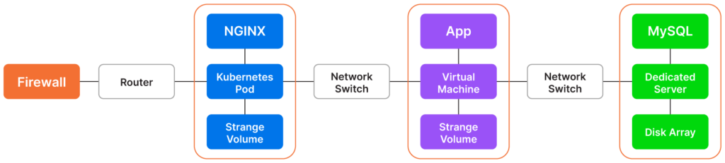
A diagram of an IT environment that includes NGINX, Kubernetes, MySQL, and other configuration items (source)
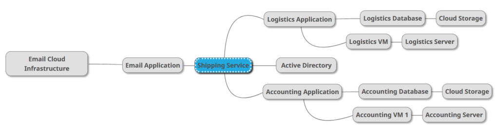
Application dependency maps
These diagrams provide a visual representation of how various applications interact with each other and the devices they rely upon. Analyzing these visualizations can provide a better understanding of the dependencies between applications and devices, which can be useful for troubleshooting, performance optimization, and capacity planning.
Power maps and heat maps
By presenting power and environmental data through visual representations, users can effortlessly interpret the information with the help of intuitive and visually captivating color-coded maps. These maps offer a centralized perspective and facilitate in-depth exploration of data related to rack power consumption as well as temperature and humidity readings obtained from sensors deployed across a data center.
Through these visual depictions, users can gain insights into the complete power chain, perform real-time monitoring of power and environmental conditions, and analyze historical data. The strategic use of color schemes in these visualizations serves as a visual cue, aiding in the identification of rack capacity.

Thermal Management (source)
CMDB visualizations, charts, graphs, and maps
These visualizations present actionable data for security and audit teams dealing with compliance with ISO 27001, PCI, HIPAA, internal controls, etc. Configuration item (CI) records in the CMDB and their dependencies are visually represented via charts, graphs, and maps. They can be used to address the performance, health, and availability of assets and to support change management, issue remediation, and root cause analysis workflows.
CMDB visualization (source)
Validating and verifying
Maintaining robust data integrity measures for the data center environment serves as a foundation for evaluating the quality of visualizations used to present the information. Poorly designed or inaccurate visualizations can lead to confusion, misunderstandings, and errors. It is imperative to verify that visualizations are effective at accurately conveying information.
Validation involves assessing whether the visualization meets the intended purpose and audience. Verification checks whether the visualization accurately represents the data. By performing these processes, potential issues can be identified and corrective action taken before the information is presented.
Performing validation and verification involves asking questions like the following:
| Validation | Verification |
|---|---|
|
|
After reviewing, return to the defining and designing steps as appropriate to iterate and optimize the visualization.
Best practices for data center visualization
To get the most out of data center visualizations, follow these best practices to transform the deluge of data into engaging and visually attractive graphics that promote effortless decision-making for the data center.
Narrate the story |
|
|
Keep it simple |
Match data with the appropriate visualization type |
|
|
Iterate and optimize |


Fastest time to value with easy implementation and agentless asset discovery
Comprehensive hardware and software inventory management

Broadest discovery from legacy technology to the latest cloud and containers
The Future
Data center visualizations have evolved significantly over the past few decades. However, even with the amazing technology and creativity in evidence in today’s products, there is much more to come in the future. The Web3 movement has created modern and inspiring designs, and virtual or augmented reality technologies promise a fully immersive experience and could revolutionize the way we view and interact with data centers. Metaverse offerings could open the door to even more possibilities.
One of the most significant advancements that companies are now promoting is the concept of digital twins, which are detailed, all-encompassing digital replicas of objects or facilities like physical data centers. This idea aligns perfectly with previous assertions about data center visualization: It has the potential to consolidate and combine all relevant data sources, such as building drawings, DCIM data, financial data, CMDB, and other critical information, into a single, easy-to-navigate representation of the data center.
Conclusion
Data center operators can become inundated with an overwhelming amount of data, leading to a lot of noise that can drown out important signals. The art of storytelling through data visualization helps tame and present this data in a way that is easily understandable, predictive, contextualized, and actionable. By following the best practices laid out in this article, the visualization of data center data can showcase the most important signals amid the noise, allowing users to quickly and accurately interpret the data and make decisions with confidence.